
Nunawave came into being when one of our team sustained an injury that turned into a chronic condition that had a huge impact on his physical and mental wellbeing. After months of seeing him get the runaround from doctors and traditional treatments, we started looking for alternative solutions to get him the help he needed. 

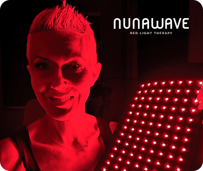
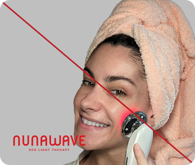
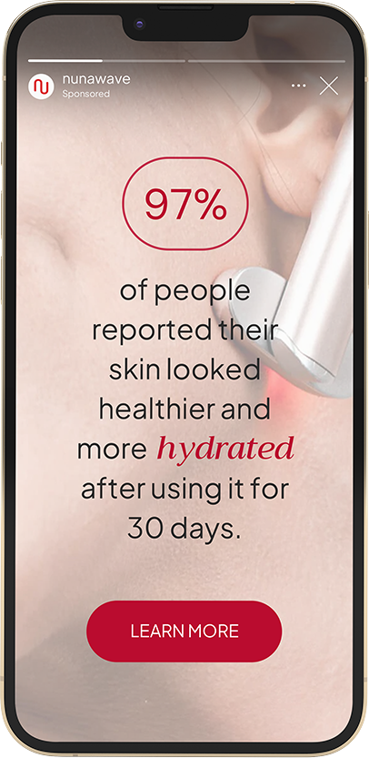
This was when we came across Red Light Therapy in our research, and it changed everything. Within a few months, the pain was gone and we had our friend back. After seeing his transformation, we realized that this was about much more than simply resolving the pain, this was about helping him to reclaim power over his own body. At a time when things felt insurmountable, his progress with RLT gave him the confidence to say “I got this”.

So then, we started to geek out on all things RLT and we wanted to learn everything about it. It wasn’t just about us anymore. It was about spreading the word to everyone looking for a natural way to overcome their pain and move forward with life.

MISSION

To share the life-changing effects of RLT so that others can overcome pain and reach their full potential.

VISION

To pave the way for people on a transformative journey of self-discovery, healing, and growth.

POSITIONING

The bridge between cutting-edge technology and personal growth.

CORE BELIEFS

  • Every individual has the capacity to heal and reclaim control over their physical and mental well-being.
  • We all possess untapped potential waiting to be unveiled.
  • Cutting-edge technology and scientific research are fundamental to transformation and personal growth.
  • We are committed to creating a supportive community, sharing knowledge, and encouraging others on their path to well-being.

PILLARS

  • Illuminate
  • Heal
  • Transform
  • Evolve

Nunawave communicates with a voice that is supportive, caring, and informative. The tone is genuine, compassionate, and educational.

PROMISE

We will support you on your path uncovering your true potential as you discover your authentic self.

TAGLINE

Illuminate, Restore, Evolve

TAGLINE MESSAGING

  • Evolve into the best version of yourself. 
  • Illuminate your goals, strengthen your mindset, evolve into the person you want to be.
  • Shine from within
  • Evolve your wellness routine
  • Illuminate your strengths and take control of your life
  • Evolve towards your goals
  • Illuminate your true potential
  • Revive your body, restore your confidence
  • Revive your passion, evolve your purpose.

The logo is the most important element of the NunaWave identity system. It should be present and visible on all branded applications and communications, both external and internal, across all media.

The logo should not be shaded, angled, warped, stretched, ghosted, outlined or used in non-brand colors.

The icon can be used independently as long as the logo is also used somewhere else within the layout.

The wordmark can be used independently.

DOWNLOAD

THE LOGO

THE ICON

WORDMARK

The wordmark can be used independently.

Clear space is the area surrounding the logo that must always be free of text and other graphic elements.

This does not apply to background artwork or photography unless it contains text.

Always maintain at least the minimum amount of clear space around the logo, equal to one half of the height of the icon (indicated as ‘X’) as shown here.

THE LOGO

THE ICON

To ensure legibility, the logo must not reduce below the minimum specifications outlined herein. The logo on this page will appear to scale at full size if printed at 100%.

This sizing is a rule of thumb for optimal legibility and should be followed whenever possible, especially on printed applications and marketing collateral where the logo is the sole representation of the brand.

In rare cases when the logo must reduce below the minimum size (favicons, thumbnails), ensure that it is as large as possible within that application, or use the icon independently.

THE LOGO

THE ICON

The NunaWave logo can be placed on top of background colors and images, but should not obstruct key elements such as human faces or text.

The level of contrast between the logo and the background must be considered. Too little contrast between the two elements will impede legibility. Always choose the logo variation, color, and placement that ensures legibility.

Note: Examples are for illustrative purposes only.

Consistent presentation of the logo builds recognition and confidence in the brand. Always apply the logo thoughtfully, carefully, and appropriately.

The logo’s form must be preserved and should not be modified in ways that compromise its visual integrity. The following treatments should be avoided whenever possible.

Note: these examples are intended to be used as a guide and do not cover all possible cases of misuse.

X

Do not stretch the logo

X

Do not rotate the logo

X

Do not squash the icon

X

Do not squash the logo

X

Do not skew, warp, or shear the logo

X

Do not set the logo in non approved colors

X

Do not apply stroke effects

X

Do not modify the scale or positional relationship of elements within the logo

X

Do not apply gradients, shadows, or filters to the logo and icon

The NunaWave logo can be placed on top of background colors and images, but should not obstruct key elements such as human faces or text.

The level of contrast between the logo and the background must be considered. Too little contrast between the two elements will impede legibility. Always choose the logo variation, color, and placement that ensures legibility.

Note: Examples are for illustrative purposes only.

Nuna Red and Wave Red are the main colors used across all core brand identity applications.

Nuna Red is used for CTA buttons, callouts, and highlighted text. The NunaWave logo uses the Wave Red.

These Accent colors should be used sparingly in digital applications only.

In digital applications, our Nuna Black is a softer, less harsh alternative to true black, and our Nuna White is the reverse of that.

PRIMARY

ACCENT

NEUTRALS

DO NOT use colors in unapproved ways. For example, Yellow as a background color.

DO NOT use colors outside of the Brand Palette.

X

Do not use Brand Colors in unapproved way.

X

Do not use colors outside of the Brand Palette.

Plus Jakarta Sans is used for Headlines and Small Bits of Copy while and also used for body and main copy.

Trirong is only used for small quotes that needs to be in italics.

PRIMARY FONTS

SECONDARY FONTS

Plus Jakarta Sans Font brings modern simplicity with clean lines, offering a versatile and sophisticated aesthetic for various design needs.

Plus Jakarta Sans is used for Headlines and Small Bits of Copy.

Plus Jakarta Sans is also intended for use at smaller text sizes.

In NunaWave it is used for body and main copy.

Trirong is only used for small quotes that needs to be in italics.

Here are some examples on how to use Nuna Fonts to create a strong visual hierarchy.

Here’s what NOT to do with our typography.

X

X

X